mp1.jpg

Morehead Planetarium Branding


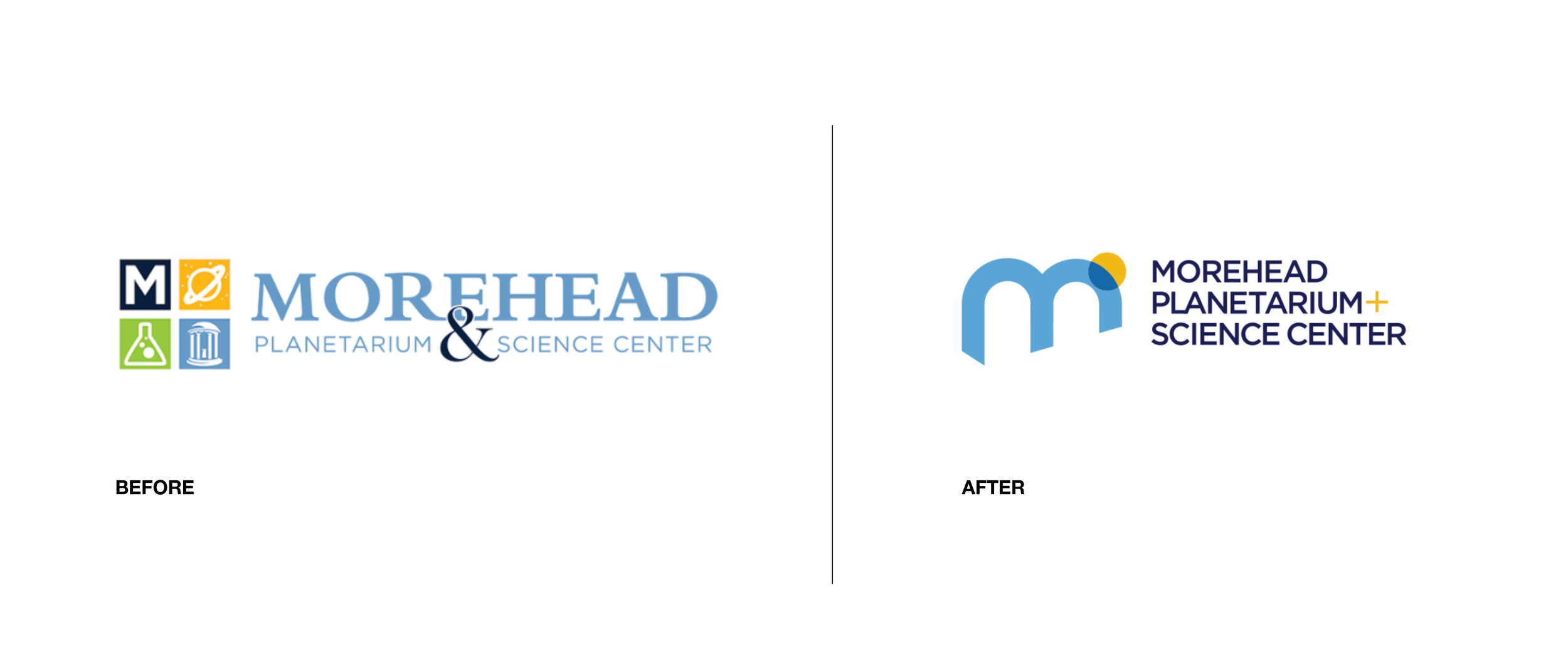
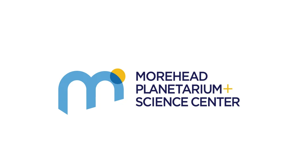
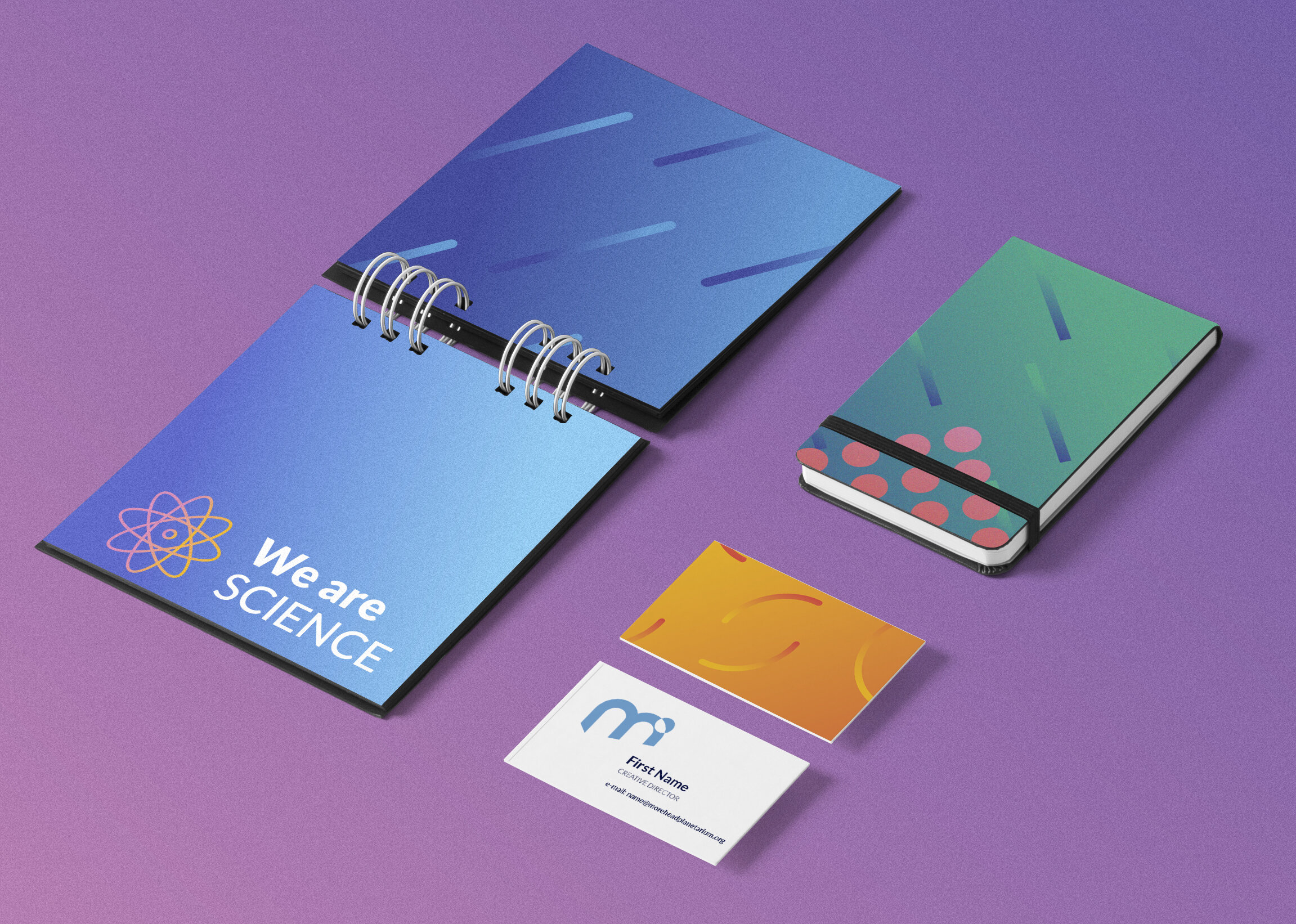
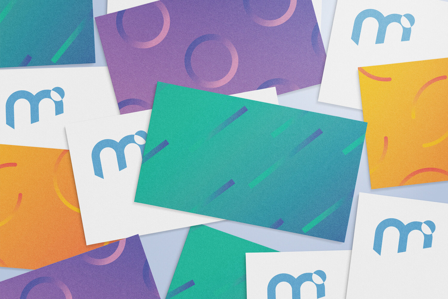
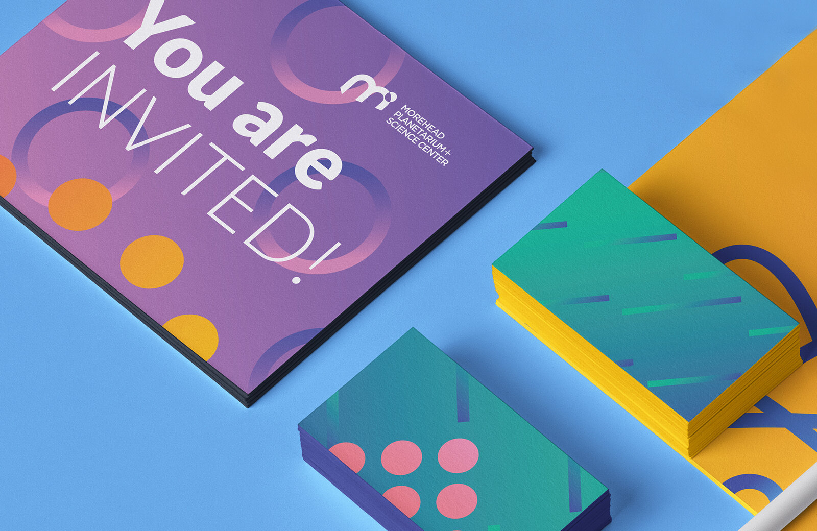
The challenge was to help The Morehead Planetarium develop and embrace a new brand identity, while still keeping it recognizable and in close association with the University of North Carolina. I designed a new logo mark and branding system, which created a new sense of functionality and legibility.

Morehead Planetarium and Science Center - Rebranding

 
Morehead _before.png

shapes_master.png

 
LOGO_GIF.gif


kkmp.jpg


mp1.jpg
 
mp2.jpg


The new logo adds more legibility and flexibility. It’s modern yet simple shape allows more ways to explore the new visual system.


pat1.jpg
pat 2.jpg
pat 3.jpg
 
MOREHEAD_PLANETARIUM_REBRAND_JPG12.jpg
 
 
11.jpg
Morehead_stationery.jpg


The color palette is bright and vibrant. In connection with the brand patterns and shapes it allows to form many unique design solutions.


Morhead stationery_detail.jpg
bc.jpg
MOREHEAD_PLANETARIUM_4.png
MP_Home_iMac_Mockup.jpg
MOREHEAD_PLANETARIUM_REBRAND_2
 
Morehead_Banner.gif
 
notepad.jpg
MOREHEAD_PLANETARIUM_REBRAND_JPG20.jpg
MOREHEAD_PLANETARIUM_REBRAND_JPG21.jpg