Hatch Breakfast Burritos

Brand Identity Refresh / Durham, NC


Hatch Burritos is a beloved Durham institution rooted in New Mexican flavors, Sunday rituals, and an extremely loyal following. As they prepared to open their first permanent brick-and-mortar location, they needed a brand system that could grow with them — something bold, warm, and instantly recognizable. I partnered with Hatch to evolve their visual identity into a cohesive, flexible system that honors their Southwest heritage while supporting their next chapter as a full-service restaurant


Hatch’s story spans years of pop-ups, cult-favorite breakfast burritos, and a community that shows up for them again and again. The identity needed to capture all of that energy and translate it into a visual language that could work across multiple deliverables (signage, packaging, menus and in-store materials) The goal was clear: build a brand that feels as fun, flavorful, and unmistakably Hatch as the burritos themselves.


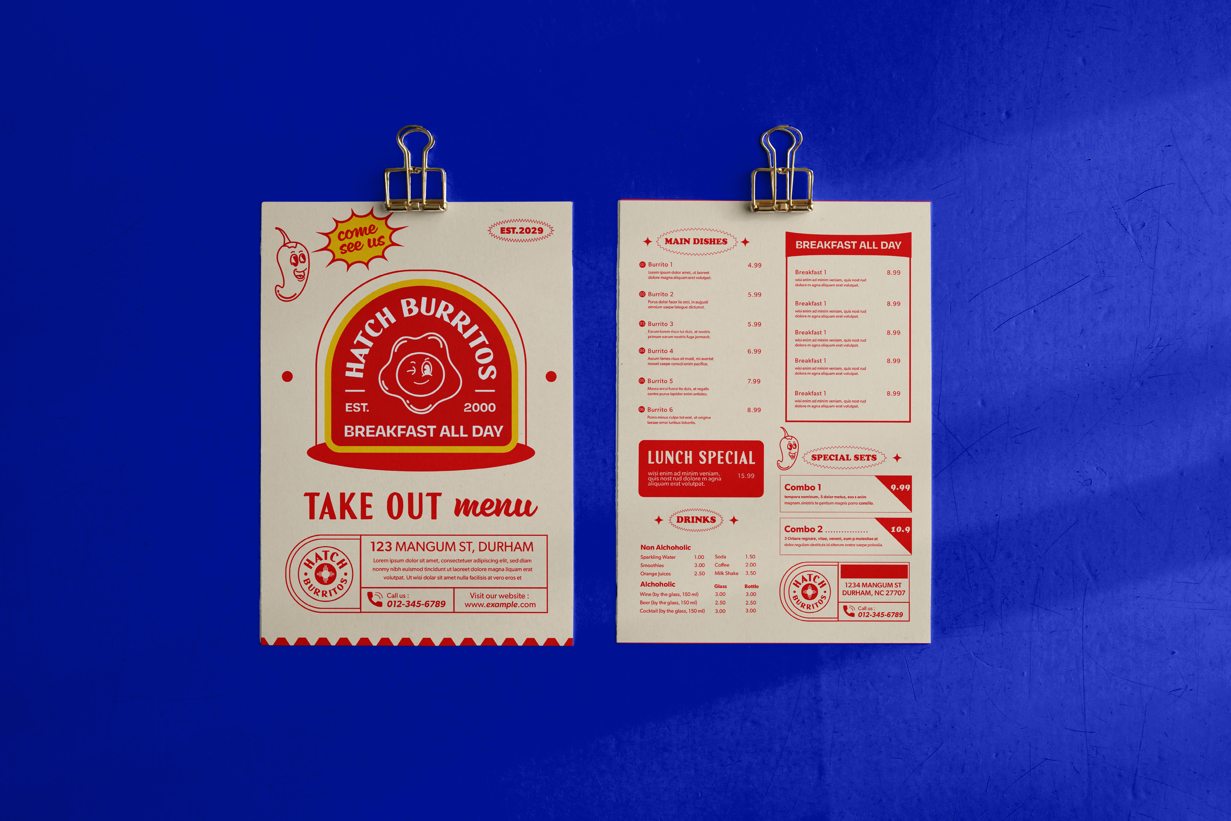
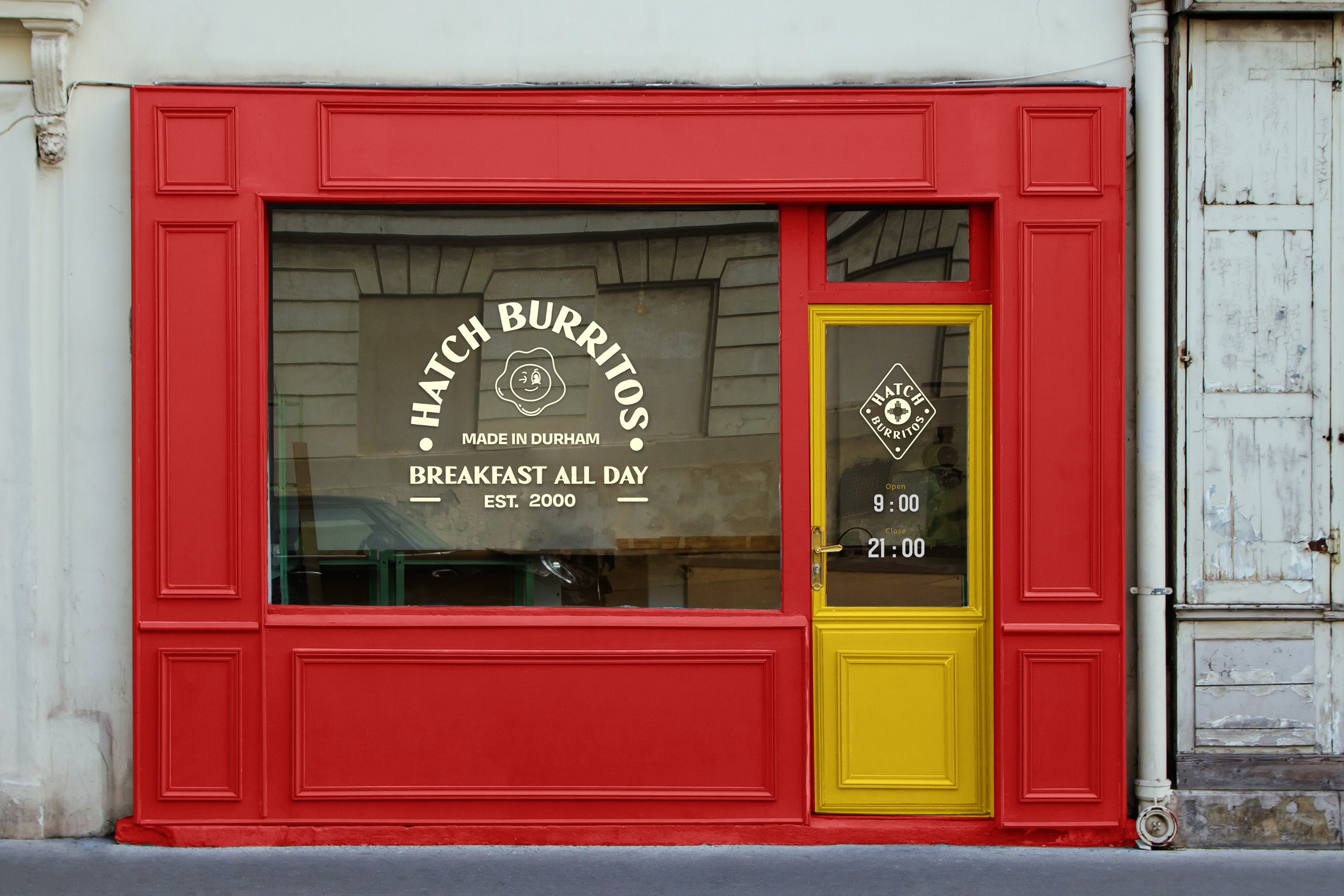
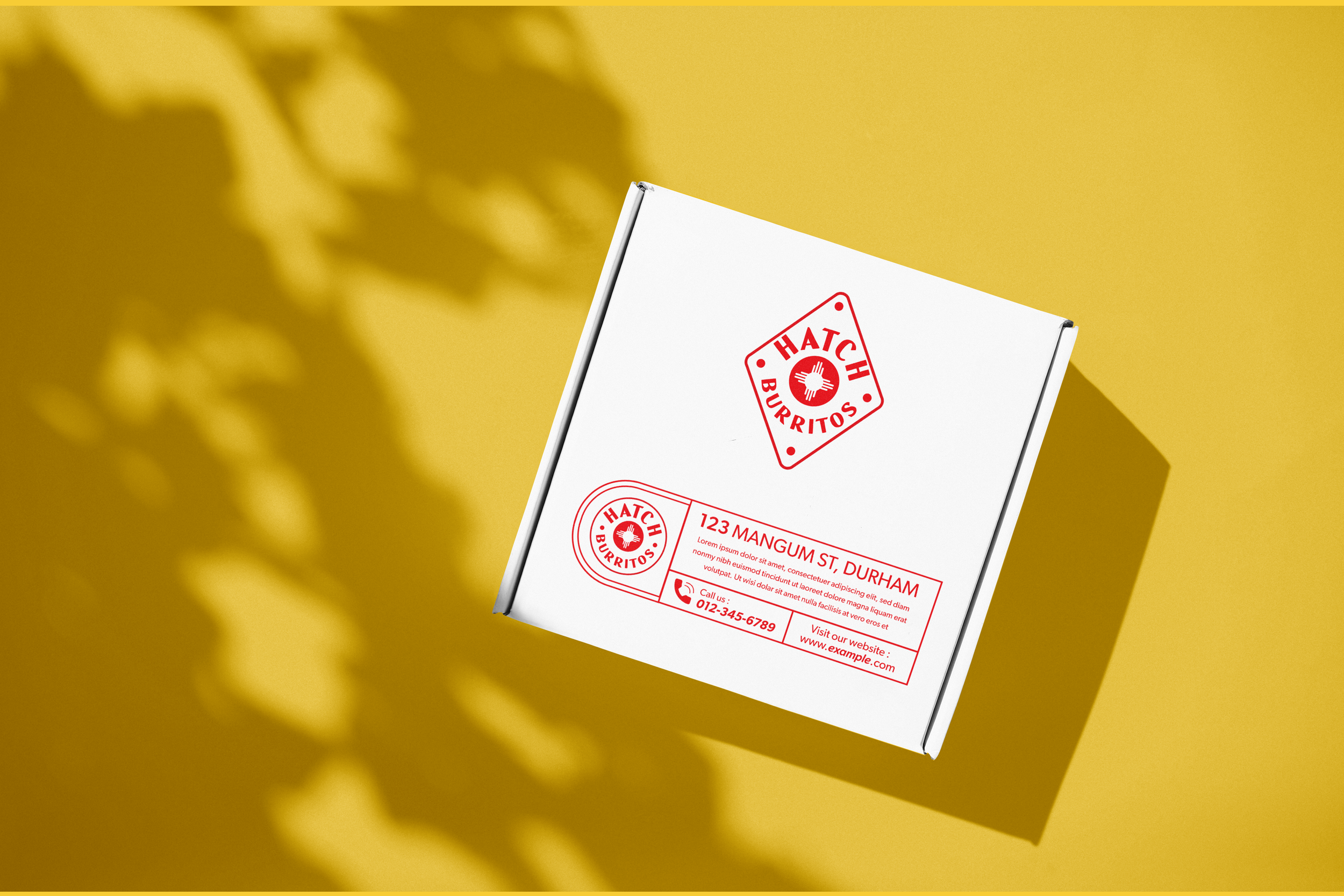
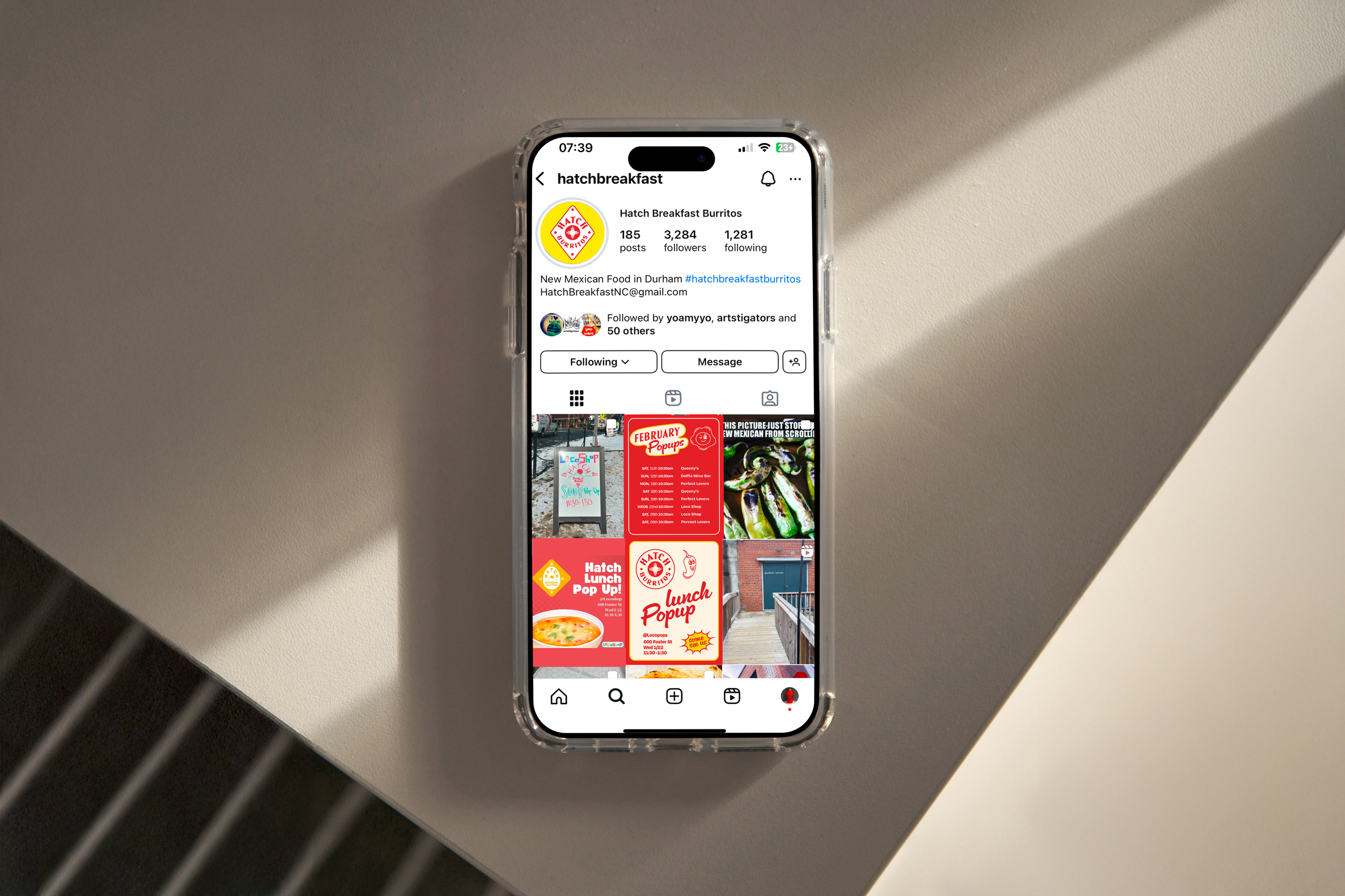
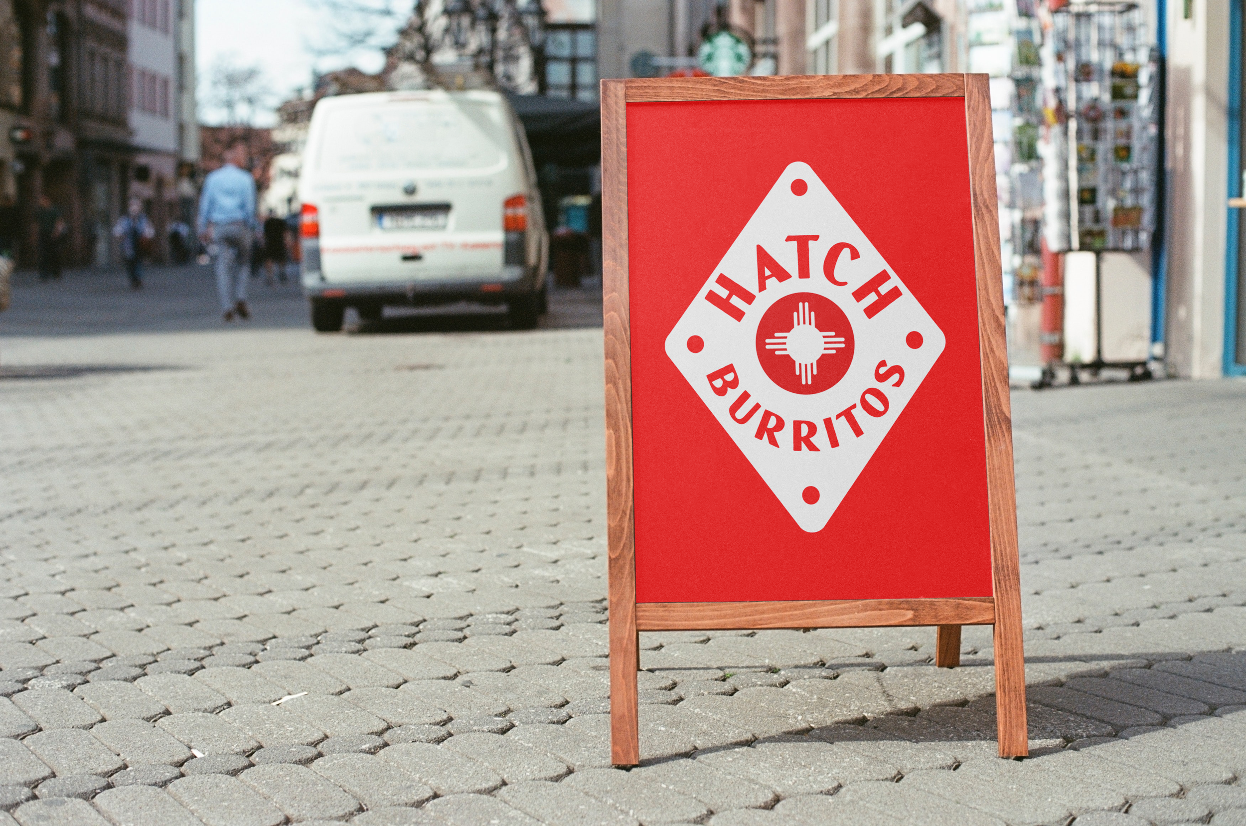
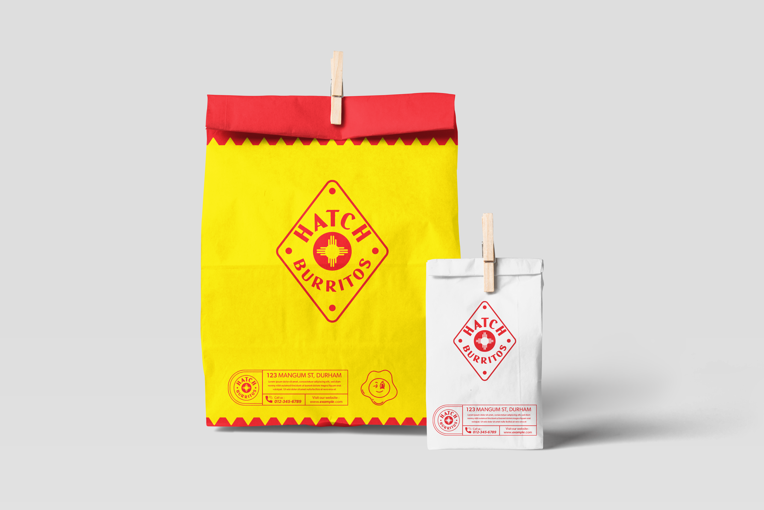
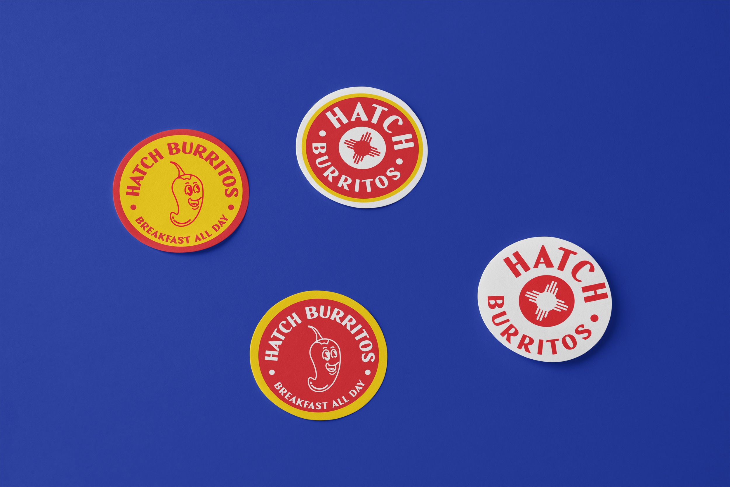
I grounded the design system in the core pillars of the brand: Heritage, humor, warmth, and bold New Mexican flavor. Using key visual cues — the iconic Zia symbol, the colors of Hatch Valley chiles, familiar diner typography, and friendly illustrated characters — I created a modular identity that blends Southwest tradition with approachable, everyday charm.


Previous
Previous

Montessori School of Durham

Next
Next

Grounded Coffee Roasters